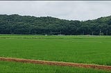
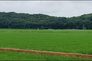
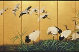
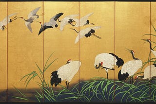
Joe HontoninJaponica PublicationThe Sad Fate of Japan’s Red-crowned CraneAnd how the “living rivers” movement could save themMar 271Mar 271
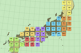
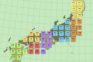
Joe HontoninJaponica PublicationMy Approach to Learning Kanji While Travelling in JapanStarting with 71 easy-to-read placenamesMar 4Mar 4
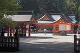
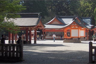
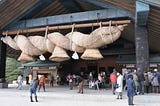
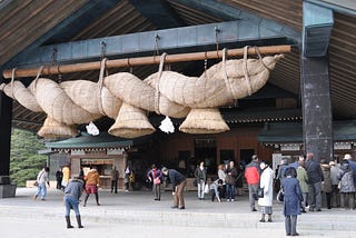
Joe HontoninJaponica PublicationKami-no-Michi or the ‘Way of the Gods’Shinto is a journey not a destination, and Japanese shrines are like support stations along life’s path.Jan 166Jan 166
Joe HontoninJaponica PublicationFinishing Up the Year Japanese StyleSuperstitions and rituals are all part of the traditionDec 19, 20239Dec 19, 20239
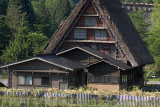
Joe HontoninJaponica PublicationVisiting One of Japan’s Most Remote IslandsYakushima is Japan’s oldest World Natural Heritage SiteDec 4, 202322Dec 4, 202322
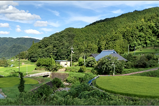
Joe HontoninJaponica PublicationThe Japanese Word That Expresses Melancholy and Joy at the Same TimeThere is an aspect to Japanese culture that I’ve come to appreciate in recent years that is nicely encapsulated by the word furusato.Nov 6, 20234Nov 6, 20234
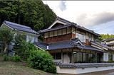
Joe HontoninJaponica PublicationMy Journey Through Japan’s Akiya House MarketVacant home prices are astonishingly cheapOct 4, 202317Oct 4, 202317
Joe HontoninJaponica PublicationWhy I Decided to Move to OkayamaJapan’s secret gem is hiding in the land of sunshineSep 21, 202316Sep 21, 202316
Joe HontonThe Whisky Tolerance SocietyAn allegorical tale of a not-so-civil warJul 22, 20231Jul 22, 20231